PRESENTATION - The Skill
While the focus of turners is on tools, techniques and procedures, scale, form, proportions, the wood and the finish - something important is often overlooked - PRESENTATION.
IF you think about presentation at all, it's usually in terms of getting a photo of a piece literally in its "best light". There's a lot of info available on how to take good pictures of your turning. But when photographing a piece you have a lot of control over the presentation that you don't have when the piece is in "the real world" rather than in carefully lit, carefully posed, isolation.
What follows focuses on presentation - in "the real world". My hope is that YOU will share observations and ideas about Presentation and I'll add them to this information and e-mail you back the url to the page with your input. (e-mail me)
The nicest wood, turned perfectly and with a beautiful shape along with an ideal finish - can easily get lost in its background setting. Place it amongst a bunch of other turnings, especially if they're packed in together (OK so I'm the only one who does THAT) and the importance of presentation becomes obvious. Put it up too high - or too low - similar problem - it can get lost or overlooked. In an unlit, glass doored cabinet - the lack of light and the reflection of the glass can all but hide the piece(s) inside. Put it next to a similar or very different piece - and your eye will jump back and forth and maybe - come to rest on one piece - or not.
To present a piece well you have to create a visual setting or stage for it - some way of visually setting aside a visual volume for it in order to begin to make it stand out from its background and its support structure, be it a pedestal, shelf or table top. And that can be done with something as simple as some white foam board, a thin rectangle of wood or a round or oval mirror - or just clear glass.
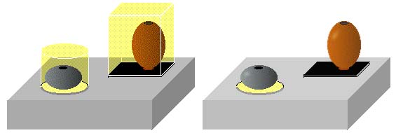
In the following illustration, yellow represents the implied visual volume created by the bases and the background environment in which the pieces are displayed. The base reserves room around the piece, leaving space for it to stand out from its surroundings, even if the surroundings is cluttered with other turnings.
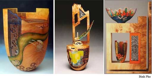
Two turners that are really good at Presentation, and familiar to most turners, are Bihn Pho and Clay Foster.
At one, almost extreme end of the Presentation Spectrum is Binh Pho. He creates a small set - a stage - on which to present his piece. The staging and the set draw attention to and focus the eye on The Piece, regardless of where it is or what's around it. Sometimes the piece itself is actually the setting for the images he puts on, or in, part of the piece. Sometimes the turning part of the piece is the stage on which a set for the main focus of the piece resides. And sometimes he will make an actual set for a piece or pieces. Which ever way he goes, he certainly knows how to capture your attention and focus it on his piece or a piece of his piece.
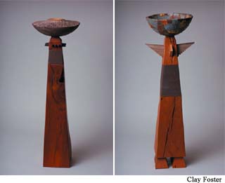
Clay Foster is also really good at presentation - in a striking yet coherent way. First, the scale of his pieces alone can make them stand out. But it is also how he integrates and incorporates what is actually the base or platform for displaying a piece that's to be noted. The first pair of pictures illustrate his obvious but well integrated pedestal approach to presentation. The height of the pedestal brings the piece up into your line of sight. Its shape and details draw the eye in - and then up to the focus of the turning at the top. But the whole thing goes together as one, not seperate pieces.
In his Ripple Series he again used a pedestal approach - but in a much more subtle, yet still very effective, way. While the tall pedestal pieces provoke a response, the ripple approach evokes a response - which may change with each viewing - like Haiku - in wood.

So with these two artists' examples of very effective presentation in mind, let's look at some presentation ideas to think about - and perhaps use.
Presenting a well done piece well, even with its own space, special lighting and dedicated display pedestal, is tricky, even in a controlled space like a gallery. Get it in a home, where people actually live, and drawing attention to it gets REALLY tricky.
But something as simple as a rectangular, round or oval base - of wood, stone, corian, etc. - a small tray, perhaps with a layer of very white sand, rice, maybe lead birdshot - or even thick mat board or foam board on which the piece can be placed - any of these can do the job.. What you're after is something that will, starting just below the piece, lift the piece up off the base support surface and be the bottom outline of a 3D visual space in which the piece resides.
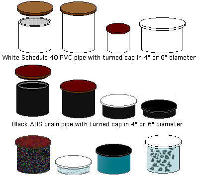
A simple pedestal can lift a piece up out of the back ground. A section of plastic pipe, with a cap, which you can turn to work with a specific piece, can do the trick. Readily available and inexpensive, you can paint it, texture it, pierce it, etc. and you can change the top if you want or need to.
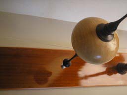
In addition to creating a visual space for the piece, the base, if reflective, can bounce some light back into what otherwise might be in shadows. AND - it may also provide another, simoutaneous view of part of the piece. The base in the following photo is just a redwood board - sanded to 400 and given three or four coats of garnet shellac followed by three or four coats of sprayed on semi-gloss lacquer
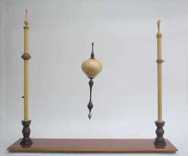
If you have trouble with K.I.S.S. (Keep It Simple Stupid,) like I often do, you can take the staging / set for the piece as far as you care to. Here's the latest example of how to get carried away with Presentation. The ornament, the focus of the piece, is supended on monofilament line in case you're wondering "How is that thing seeming to float in the air?"
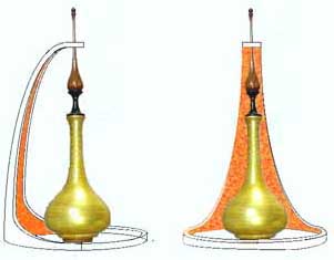
Here's another Presentation idea I'm playing with - for a stealth spinning top I've done. The top is very unstabile so it needs to be constrained so that it can only spin - not wobble. A cut up, upside down cup, a hole to constrain the top of the top so the piece can't fall over, A patinaed copper foil on the inside surface will frame the piece when viewed from the front.
NOW are you starting to think about ways to PRESENT your next piece? What about the one that's hidden amongst your other turnings on that shelf over there?
Got a Presentation idea you'd care to share? If so, how about e-mailing it to me for inclusion here?
