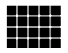
Try counting the white circles with the black dots in the center
Design Tricks
The following image illustrates a characteristic of a bad design - you're eye can't settle anywhere long enough to see anything. You're attention and focus are constantly shifting as your peripheral vision keeps distracting your focused vision while your brain tries to make sense of the conflicting visual input. This type of problem often occurs with pieces with very busy grain and/or highly contrasting woods and/or an over abundance of carving and details.

Try counting the white circles with the black dots in the center
You'd like your design to have a main focal point to catch the eye and then, with the wood's grain, color, finish, other shapes and details, lead it around the piece in a comfortable way before returning to the main focal point to begin again. This will hold the viewers interest - something a good design does well. Artists and architects use this "trick" all the time to catch and hold a viewer's interest.
There are several tricks you can use. Let's look at some of those tricks.
How we look at things varies a bit by culture. Many of us are conditioned to read Left To Right and Top Down so things that have this visual interest path are familiar to us. But other cultures read Right To Left, Top To Bottom or Bottom To Top. You shuuld consider your "audience" when designing
We "read" the clock in a clockwise direction (Duh!) so patterns that involve clockwise visual interest are more "natural" for us to view than a pattern with counter clockwise visual interest. Who knows how this will change if digital watches and clocks take over the world (or if you live in the souhtern hemisphere).
Examples 1 and 2 have a clockwise viewing path, despite the fact that example 2 is a counter clockwise spiral. When you get to the end of the viewing path the eye moves naturally back to the beginning again. This "trick" holds your interest better than the counter clockwise viewing paths of examples 3 and 4