Evolution of a Design Idea
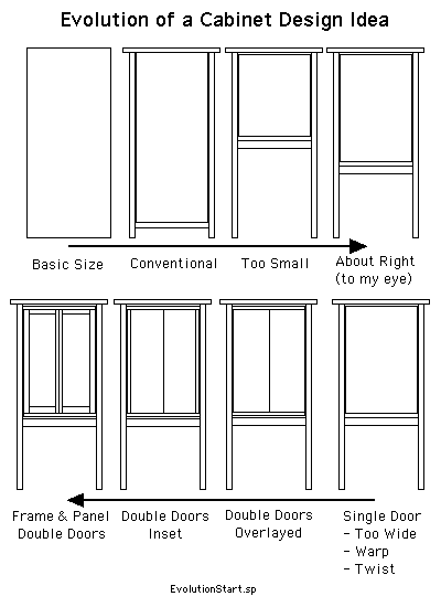
After going through James Krenov's The Fine Art of Cabinet Making I wanted to have a go at developing a design that was clearly inspired by his style. I tried to keep notes on things that came up as the design evolved. I started with the space the cabinet would fill - the height and width. Once that was more or less tied down I had to decide how much of this space would be the cabinet and how much would be the space below the cabinet. This was a play around with proportions thing rather than using a formula like the Golden Rectangle (there'll be a sample of the Golden Rectangle later)

Once the basic shape and proportions were decided on the wood started becoming a factor which had to be addressed. A single 24 to 26 inch wide door would a) be heavy and b) probably warp / cup / twist.even if framed with rails and stiles. That meant two doors and the upper space would also be divided up. Would just breadboard ends be enough to minimize cupping?
The doors would be frames with flat panels. And that meant another decision point. If the center side stiles were the same width as the outside stiles they'd visually seem too wide since two would be side by side.
The width of the stiles might have some constraints because of the requirements of the hinges used. Ah - a detail I thought I'd be dealing with later popped up very early on. Euro hinges were out - didn't go with the Krenov idea. Krenov uses knife hinges because they hardly show at all. But you've got to be really good to do knife hinges correctly and I know I ain''t good at all with hinges. Piano hinges are really strong - but they're not trivial to install correctly. They'd also put a shiny metal line on the outside edges of the doors - just wouldn't work visually. There are barrel hinges which wouldn't show at all - but I probably need four per door AND they have no way for adjustment - critical since a weird gap between the doors would be really obvious. So a pair of mortised in regular hinges would have to do. They're available in shades of brown so they wouldn't be that obvious, or at least not glaring.